
Meta Viewport Tag
In the world of web design, ensuring that websites render correctly on a myriad of devices, from desktop monitors to mobile phones, is a challenge. To aid in this endeavor, the meta viewport tag is a crucial tool in the developer's arsenal.
What is Meta Viewport Tag?
With the diverse range of devices available today, web developers must ensure that websites are adaptable and user-friendly on screens of all sizes. HTML5 introduced the <meta> viewport tag to address this challenge, giving web designers greater control over the viewport.
How Does It Work?
At its core, the meta viewport tag informs the browser how the page should fit the device's screen. Mobile devices usually shrink websites to fit the screen width if this tag is missing, making the content readable without zooming in.
Here's a typical example of the meta viewport tag:

Setting up the Meta Viewport Tag
The viewport refers to the visible area of a web page on a device, whether it's a desktop monitor, a tablet, or a mobile phone. The meta viewport tag controls the viewport's dimensions and scaling.
You should incorporate this meta viewport tag in all your web pages:
width=device-width: Sets the page width to match the device's screen width.initial-scale=1.0: Establishes the initial zoom level when first loaded by the browser.
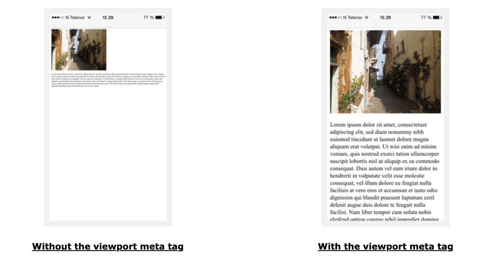
Using the meta viewport tag, the content adjusts based on the device's width, enhancing user experience. To demonstrate the difference, consider a web page viewed without the meta viewport tag and one viewed with it. The latter will adjust to the screen size on a mobile or tablet, while the former might require horizontal scrolling or zooming.
Meta Viewport Properties Explained
The meta viewport tag has various properties:
- width and height: They control the size of the viewport. You can set specific pixel values or use
device-widthanddevice-heightto set them to 100% of the viewport's width and height. - initial-scale: Determines the zoom level when the page is initially loaded.
- minimum-scale and maximum-scale: Define the zoom limits for the page.
- user-scalable: Dictates if zooming is allowed. Using
user-scalable=nois not recommended as it affects accessibility. - interactive-widget: This property determines how interactive UI widgets, like virtual keyboards, impact the page's viewports.
Why is It Important?
- Mobile Optimization: As mobile browsing has overtaken desktop, a responsive design ensures users on mobile devices have a seamless experience.
- Improved User Experience: Properly scaled content means users don't have to pinch or zoom to read the information, leading to a more enjoyable browsing experience.
- SEO Benefits: Search engines, like Google, prioritize mobile-optimized sites, leading to potentially higher rankings in search results.
Best Practices for Meta View Port
- Avoid Fixed Widths: While using the viewport tag, ensure that design elements are not set with fixed pixel widths. This could disrupt the responsive nature of the design.
- Test Across Devices: Given the many screen sizes, always test how your website appears across various devices and browsers.
Conclusion
The meta viewport tag is instrumental in today's mobile-centric browsing environment. It ensures that irrespective of the device being used, a website renders in the most user-friendly manner. By mastering this simple but powerful tool, developers can ensure a consistent and optimal user experience for everyone.
FAQs
While not mandatory, it's highly recommended for sites aiming for mobile compatibility and a user-friendly experience on all devices.
Yes, using user-scalable=no will prevent zooming. However, it's generally not advised as it can hinder accessibility for users who need to zoom in.
Alongside the meta viewport tag, use responsive design techniques, such as media queries and flexible grids, to adjust content based on different device sizes.
The meta viewport tag ensures websites display correctly on various devices. For SEO it's crucial because Google prioritizes mobile-friendly sites, impacting rankings and user experience on mobile devices.